************
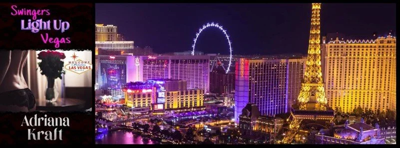
I am so excited about this cover from Veridian Rose Graphics for our upcoming release! My husband and I, who write together under this pen name, created a (very) short story to give our readers a sample of the highly charged erotic world enjoyed by a fictional mid-life couple in the swing lifestyle. Swingers Light Up Vegas will be released on January 30, and pre-order will be available later this week.
On our last trip to Las Vegas, we scoured the city for photos and adventures we could gift to those characters, hoping one of the pics could be used on our cover.
Did our cover artist use them?
No, but it wasn’t her fault.
We’d told her we wanted two things on the cover: something sexy, and something that anchored the cover explicitly in Las Vegas.
So even though all the photos say “Vegas” to me, none of them really scream it for anyone else. The fabulous High Roller LINQ? Lots of cities have those by now, and a nighttime shot says nothing about which city it is. Ditto a Lazy River. Pick a tropical setting anywhere (or even just a relatively warm one), and lots of resorts sport them. The view from the Stratosphere? We actually didn’t even send her that one; it does picture the famous strip, but from such a distance that it’s not distinctive. And the same with the view out our 8th floor window. It gave us lots of pleasure, every night, to watch the sun set over the south end of the strip, but the photo isn’t identifiably Vegas. You can catch all those photos at https://wp.me/p9O7pv-336
Valerie June Bondarenko of Veridian Rose Graphics is the artist we approached to create our cover. She began by offering us several “sexy” photo options to consider, and both Hubs and I were immediately drawn to the shot with a window, roses in a vase, and a partially clad female torso wearing black lace. Perfect. The swing lifestyle is focused on women and what women want; men may love to ogle, but women call the shots. We think our cover gives her the power to beckon, and the power to say no.
Next question: what to put in the window? That’s where we’d thought the High Roller LINQ could go, but it didn’t really work, and it would still have left us with the question of how to convey Vegas. Valerie came up with the idea of the iconic Las Vegas welcome sign in the window, and when we got the draft, we both said “wow.” It’s perfect.
Next dilemma: the window-roses-black lace pic wasn’t the right dimensions for a cover, and anyway we still needed placement for the title and author. We were clueless, but Valerie came up with the dark red lace on black borders top and bottom. This is why she's the artist.
Last issue: font for title and author. We thought about neon lights – we think she’s captured that spirit in the title font and colors. Plus it’s a fun touch that “light up” actually lights up the title. And who doesn’t love seeing their name in big bold letters?
So yes, we signed off on her first complete cover draft immediately and are thrilled we did. We highly recommend her:
Veridian Rose Graphics
